A website that works like the product: powerful, simple, and clearly different
We redesigned Redactable’s marketing site to match the clarity and precision of its AI-powered redaction tool. The new site visually explains how redaction works, makes the product feel approachable, and supports long-term growth. Built in Webflow, still going strong four years later.
What they needed
- Visual consistency with the product
- Clear explanation of “true redaction”
- A design that stands out in a dull, technical space (easy!)
- A scalable foundation for content and marketing

Finding the right direction: modern, trustworthy, and different from the tech Saas crowd
Redactable’s founder had explored several design directions but hadn’t yet found one that captured the product’s clarity and value. The challenge? Translate the magic of their product: a brilliantly simple AI redaction tool into a site that feels modern, trustworthy, and different from the tech crowd. The old site felt flat and lacked connection to the app. It needed a clear upgrade in tone, design, and usability.
This wasn’t just a redesign for aesthetics, it was part of a strategic move to validate the product in the legal sector. We had to speak directly to legal professionals who value ease of use and security, without overwhelming them with tech jargon.

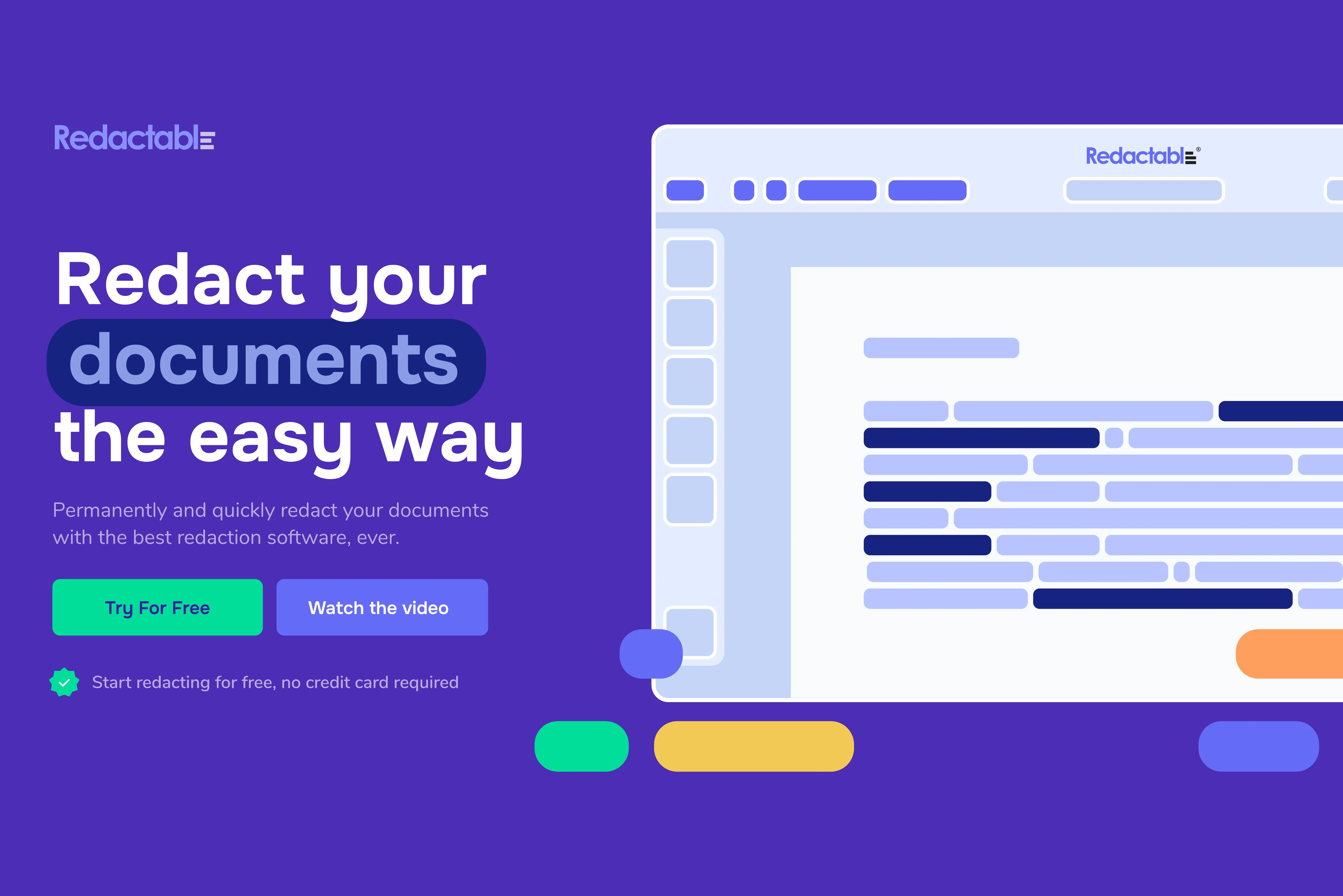
Turning redaction into interaction
Instead of just telling users about redaction, we showed them.
Visual cues, animation, and interaction let visitors feel how the product works: text is struck through, hidden, revealed. These micro-moments reinforce the product’s promise without requiring heavy reading.
We designed for an audience that’s smart, but not necessarily tech-savvy—legal secretaries, paralegals, and attorneys who need clarity, speed, and peace of mind. Every choice was made to reduce friction and build trust.
And because it’s built entirely in Webflow, the Redactable team has full control: adding landing pages, scaling content, and keeping things fresh without touching too much code.
Design highlights that made it stick
Sharpened logo for a more confident feel
Color palette with more energy for social and digital presence
Subtle animation to support, not distract
Clear content structure built for growth
The visual tone echoed the founder’s story: someone who lived the pain point and built the tool they wished existed. That authenticity had to come through.


Giving Redactable a clear voice in a crowded market
The site continues to perform, It’s a reminder that when design is based on clarity and intent, it doesn’t need to be redone every year.
Want your tech product to feel trustworthy and unforgettable? Let's talk.
Link to live site or preview
Encourages further exploration. Example:
Explore the live site → redactable.com
